London 2012 Olympic Logo Brouha
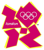 The new London 2012 Olympic logo is supposed to be an iconic representation of the date 2012. Can you make it out? The word London and the Olympic rings are included in the first two digits of the logo. The controversial new logo was designed by Wolff Olins and costs £400,000. The jagged logo comes in a series of shades of pink, blue, green and orange and will evolve in the run-up to the Games
International Olympic Committee president Jacques Rogge described the logo as “truly innovative.” That’s where the complements ended. Within hours of the launch, an online petition was set up asking for a new logo or a return to the bid design. By late Monday, the petition had received more than 5,500 signatures. Blogs on newspaper websites for the Guardian, the Daily Telegraph, the British Broadcasting Corp., Design Week magazine and others all contained negative comments on the logo design.
For example
The Daily Mail (“Is this the work of a painting chimp, Turner Prize artist, children’s jigsaw maker, graffiti tagger… or trendy £400,000-a-go design agency?”)
The Times (“An excuse for a logo?”; “Five good things about the 2012 Olympics logo… 5. If you yearned to live in a society where people have cause to use the phrase ‘What were they thinking?’, your boat may have come in.”)
The Daily Express (“A mess, a scribble… yes it’s our £400,000 new Olympic logo”)
The Daily Mirror (“Olympic low-go!… and it cost £400,000”)
The Sun (“Olympic spillage. £400,000 London logo looks like graffiti splat”)
BBC is conducting an online poll. So far, the results are overwhelmingly negative. Check it out and add your own vote.
If you read the logo horizontally it spells out 2012. But have you noticed that if you read the logo vertically instead of horizontally that it just as clearly spells out ZION? What’s up with that?